From zero to AI-powered media workspace in 2 weeks

From zero to AI-powered media workspace in 2 weeks

TEAM

1 Product Designer (me), 1 Developer, Client (Product Owner)

TIMELINE

2 weeks MVP Sprint

TYPE

AI Native / B2B SaaS / MVP sprint

BACKGROUND

A media studio's feedback lived in email. Their creation lived in disconnected tools. I designed a unified AI-native workspace — solo, from discovery to dev handoff — in a single sprint.

CHALLENGE

How might we give a media production team one workspace where AI-assisted creation and real-time team feedback happen together without technical overwhelm?

0 Rounds

0 Rounds

Structural rework after handoff

2 Weeks

2 Weeks

Full design handoff sprint

~40% Reduction

~40% Reduction

In Feedback loops(estimated, not yet measured)

My Process

My Process

1

2

3

4

5

DISCOVER

Client convo + competitive audit

DEFINE

3 design goals from real pain

DESIGN

Straight to high-fi (intentional)

ITERATE

Stakeholder walkthroughs

HANDOFF

Dev-ready in week 2

Discovery — what I actually had to work with

Discovery — what I actually had to work with

The client provided a requirements document written with AI assistance — high-level, vague, heavy on outcomes like "easy to use" and "collaborative" with no further definition.

Rather than ask for a rewrite (which would cost days), I ran a short discovery session with the studio team directly. I learned: their most-used tool was Freepik's AI assistant, meaning they were already comfortable with AI creation. Their biggest delay wasn't making things — it was iterating on them together. Feedback came in via email, disconnected from the actual asset.

I also ran a quick competitive audit of Frame.io, Figma, and Notion to identify what patterns work when feedback needs to be contextual and precise.

Core insight: This wasn't a creation problem. It was a collaboration and feedback problem.

Design Goals

Design Goals

1.

Unify all creative stages in one app

Unify all creative stages in one app

2.

Enable seamless collaboration, real-time feedback

Enable seamless collaboration, real-time feedback

3.

Hide AI complexity, let users direct, not prompt

Hide AI complexity, let users direct, not prompt

Key Decisions — what I chose and why

Key Decisions — what I chose and why

Skipped lo-fi wireframes entirely

The client had no product literacy. Showing grey boxes generated confusion, not feedback. I moved straight to high-fidelity so they could react meaningfully from day one. This was a professional judgment call, not a shortcut.

Tradeoff: less structural exploration, more upfront polish cost

One scene per script (hard scope cut)

Multi-scene flows were out of reach for a 2-week sprint. I framed this as a product decision — linear workflows reduce cognitive load — not just a constraint. Everything else was logged for V2.

Tradeoff: limits power users; deferred to V2

One scene per script (hard scope cut)

Multi-scene flows were out of reach for a 2-week sprint. I framed this as a product decision — linear workflows reduce cognitive load — not just a constraint. Everything else was logged for V2.

Tradeoff: limits power users; deferred to V2

Two collaboration paths, not one

My first instinct was a single unified editing mode. But in walkthroughs, users didn't know if they were editing or annotating. I separated direct edit and contextual comment into two explicit paths — more UI complexity, zero ambiguity.

Tradeoff: slightly more complex UI, eliminates confusion

Design goal 1 :
Unify All Creative Stages In One App

Design goal 1 :
Unify All Creative Stages In One App

One pipeline. No tool-switching.

One pipeline. No tool-switching.

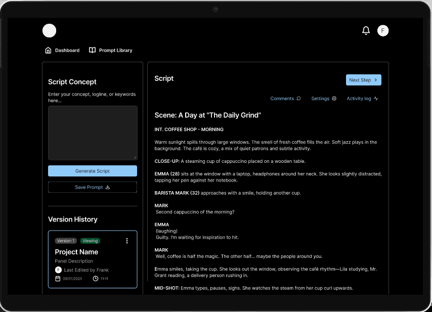
The studio jumped between 3+ tools daily. I collapsed the entire pipeline — Script → Storyboard → Panels → Video — into one linear workspace. One tab. No context switching.

Goal 1

Goal 1

Goal 1

Design goal 2 :
Enable Seamless Collaboration, Real-time Feedback

Design goal 2 :
Enable Seamless Collaboration, Real-time Feedback

Feedback where the work lives

Feedback where the work lives

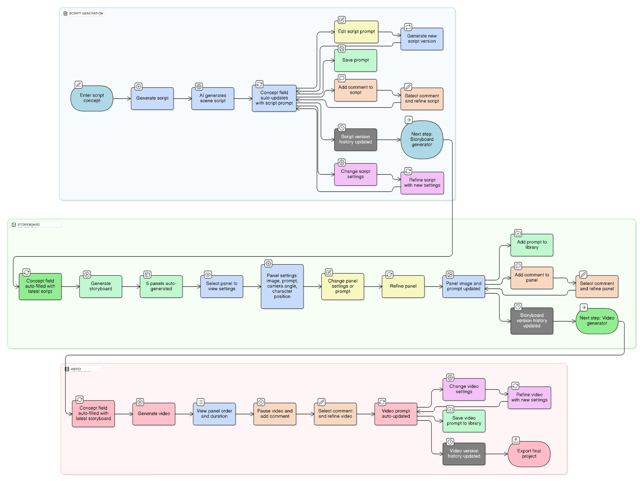
Feedback was arriving via email — disconnected from the actual asset. I gave every stage two explicit paths: direct edit or contextual comment.

Feedback now lives where the work lives.

Edit or annotate — never both at once

Edit or annotate — never both at once

Early walkthroughs revealed the problem: users couldn't tell if they were editing or annotating. Separating the two paths eliminated that confusion — same outcome, no ambiguity about intent.

Frame-Accurate Feedback

Frame-Accurate Feedback

Generic video feedback leads to endless back-and-forth. Timestamped comments pin feedback to the exact frame — so "fix the transition at 0:14" means exactly that.

Goal 2

Goal 2

Goal 2

Design goal 3 :
Reduce Technical Overwhelm

Design goal 3: Reduce technical overwhelm

The constraint became the feature

The constraint became the feature

Multi-scene flows were out of reach in a 2-week sprint. I made the constraint a feature: one script, one scene, one clear path forward. Complexity deferred to V2 — deliberately.

No blank canvas. Start with structure.

No blank canvas. Start with structure.

Blank canvas anxiety kills momentum. The system opens with 5 auto-generated panels — a starting point, not a constraint. Add or remove freely.

Four operations. One button.

Four operations. One button.

Four operations. One button. "Refine Panel" saves changes, regenerates text, creates a new image, and logs version history simultaneously — the complexity is real, just invisible to the user.

No manual prompt rewriting. Ever.

No manual prompt rewriting. Ever.

Rewriting AI prompts manually after every edit is a workflow killer. Any change — reorder, refine, comment — auto-updates the full prompt chain behind the scenes.

Goal 3

Goal 3

Goal 3

Create a free website with Framer, the website builder loved by startups, designers and agencies.