
TEAM
1 Product Designer (me)
TIMELINE
2 months MVP Sprint
METHODS
User interviews. Competitive analysis. Persona & empathy mapping. User flow · A/B usability testing
TYPE
Consumer App/ Concept project

BACKGROUND
Most recipe apps assume you'll go shopping. Spice Up assumes you won't. It starts with what's already in your kitchen and works backwards to a meal worth cooking.
CHALLENGE
How might we help busy home cooks find a meal worth making -using only what they already have - without turning recipe discovery into another chore?
labeled badges vs icon tooltips
Personas, empathy maps, user flow
1
2
3
4
5
RESEARCH
5 interviews + competitor audit
SYNTHESIZE
Persona + empathy map
MAP
Full user flow
DESIGN
Lo-fi → Hi-fi
TEST
A/B test + iterate
Most recipe apps assume you'll go shopping. Spice Up assumes you won't. It starts with what's already in your kitchen and works backwards to a meal worth cooking.
This was a 3-month personal project — the most process-complete work in my portfolio. I built it the way I'd want every project to run: structured research first, defined personas, mapped user flows, then designed and tested before a single final screen was committed to.
5 scripted sessions. Each one started with how they currently decide what to cook, not what they'd want from an app. The quotes below came up — unprompted — across multiple interviews.

I want to cook, but after a long day, I want ideas fast—I don’t have time to search for hours.


I try to eat healthy… but half the time I’m not sure if I actually am.
Instead of testing the apps myself, I read what real users said about them — app store reviews, Reddit threads, social comments. Two patterns appeared in all three: forced sign-ups and poor filtering. Both became design priorities.

Poor Search & Filtering
Forced Sign-Ups/Paywalls
1.
2.
Most filter systems front-load every option at once — creating decisions before users have even seen any results. I flipped the order: set your essential constraints before searching (dietary needs, max time), then refine after results appear, then sort when you're close to a decision. Three stages of control, each arriving exactly when it's useful — not all at once.

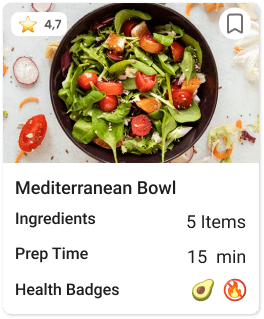
The goal was to make opening a recipe optional, not necessary. Every card answers the four questions users asked most in interviews: Is it fast enough? Do I have what it needs? Is it healthy? Does it look good? Answer those four on the card — users only tap when they've already decided.


Competitors had more filter options — but all presented as uniform tags: same shape, same color, same size. Testing showed users took significantly longer to find a single filter in that layout. I mixed UI elements deliberately: dropdowns for time, sliders for budget, toggles for dietary needs, tags for cuisine. Different shapes for different types of decisions — scanning becomes instant.

I tested two approaches: labeled tags for clarity and icons with tooltips for compactness.
Since Spice UP is a mobile app, I prioritized clarity and chose labeled badges so users could instantly understand the meaning without extra interaction.

Since the app’s main value is searching recipes based on available ingredients, I designed a two-level filtering flow.
Users can add up to three ingredients and set basic filters on the first page, then refine results with extra filters in the next step if needed.
This keeps the process simple at first while giving more control to users who want precise results.


Ship a V2 scope document alongside the designs — the scanning feature and multi-ingredient expansion deserve a written rationale, not just a mental note.
Test the ingredient search entry point earlier — I committed to text input before validating that users understood the 3-ingredient limit. One early test would have surfaced that confusion sooner.


